Print Design
Effective print marketing requires more than attractive visuals. I emphasize strategic information hierarchy, compelling messaging, and design that guides readers through a clear journey. These projects demonstrate my ability to transform complex business information into engaging, actionable marketing materials.
For our senior living clients, I created a marketing package for a whimsical community, Still Kickin’ Senior Living. The package was a hit with protential clients, bringing in dozens of leads from corporate-level decision makers who appreciated a touch of humor in their day.
Content Strategy & Hierarchy
Every successful brochure or flyer begins with understanding the audience’s needs and the client’s objectives. I work closely with stakeholders to prioritize information, develop compelling messaging frameworks, and create logical content flows that move readers toward desired actions.
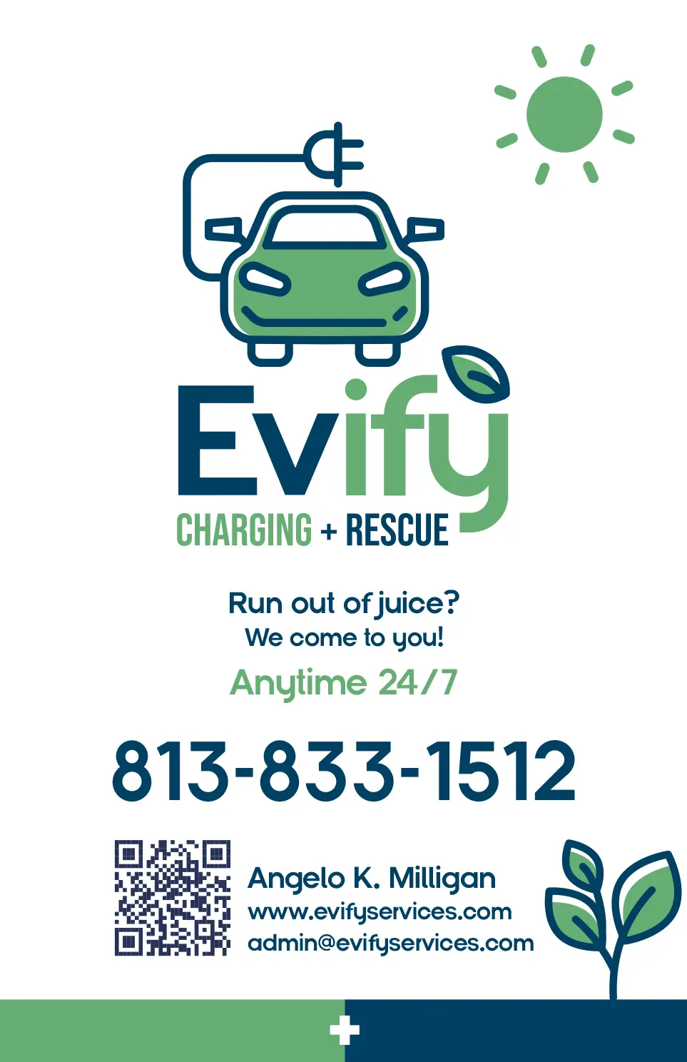
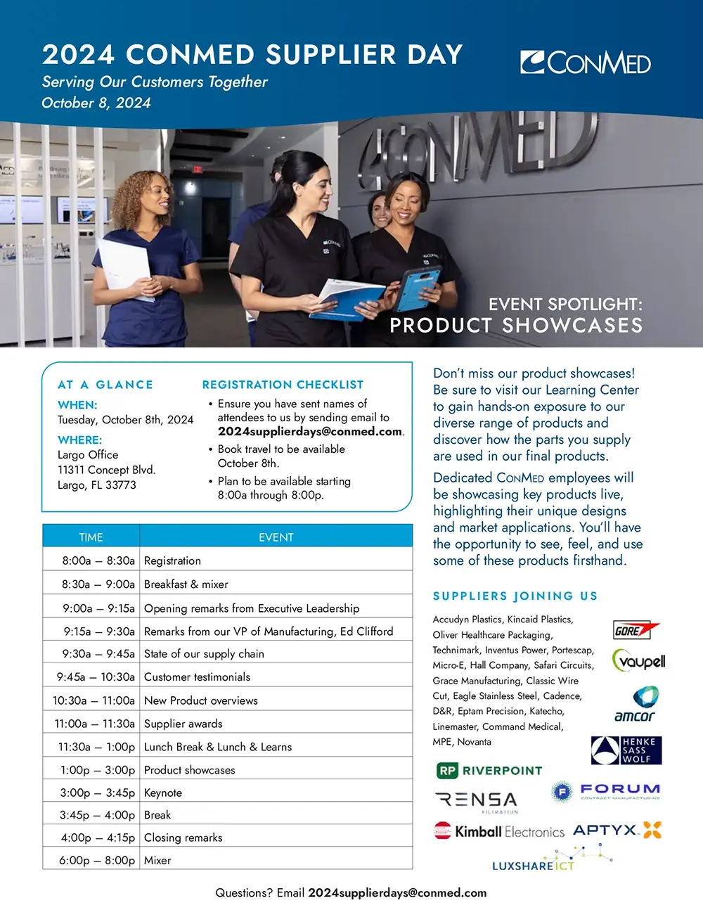
Whether it’s a detailed service overview like the ConMed Supplier Day agenda or a simple call-to-action like Evify’s emergency services flyer, I ensure every element serves the communication strategy.
Visual Communication & Brand Consistency
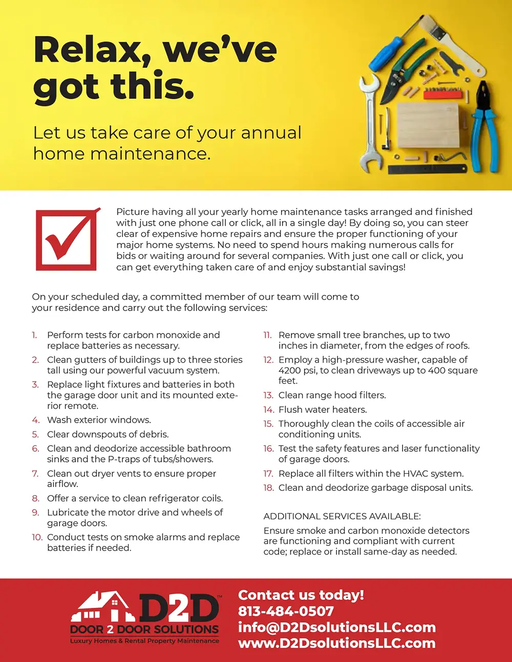
My designs balance visual appeal with functional clarity. The D2D Solutions home maintenance flyer uses bold, approachable messaging with clear service benefits, while the Clear Water environmental piece leverages natural imagery to reinforce sustainability messaging.
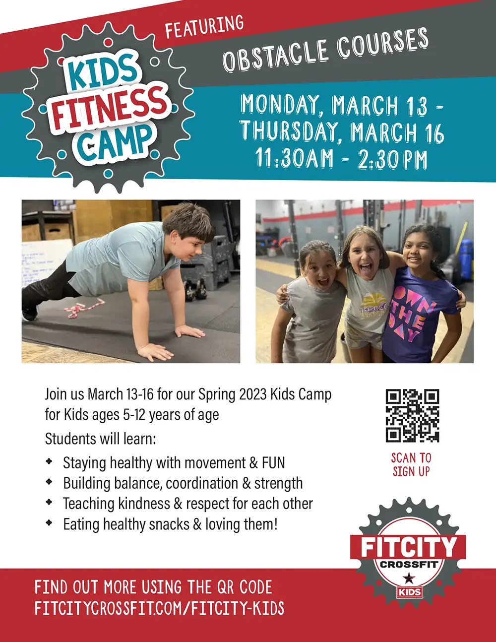
Each piece maintains brand consistency while adapting to specific campaign needs—from the professional conference materials for ConMed to the energetic, kid-focused design for Fit City’s obstacle course camp.

Multi-Format Versatility
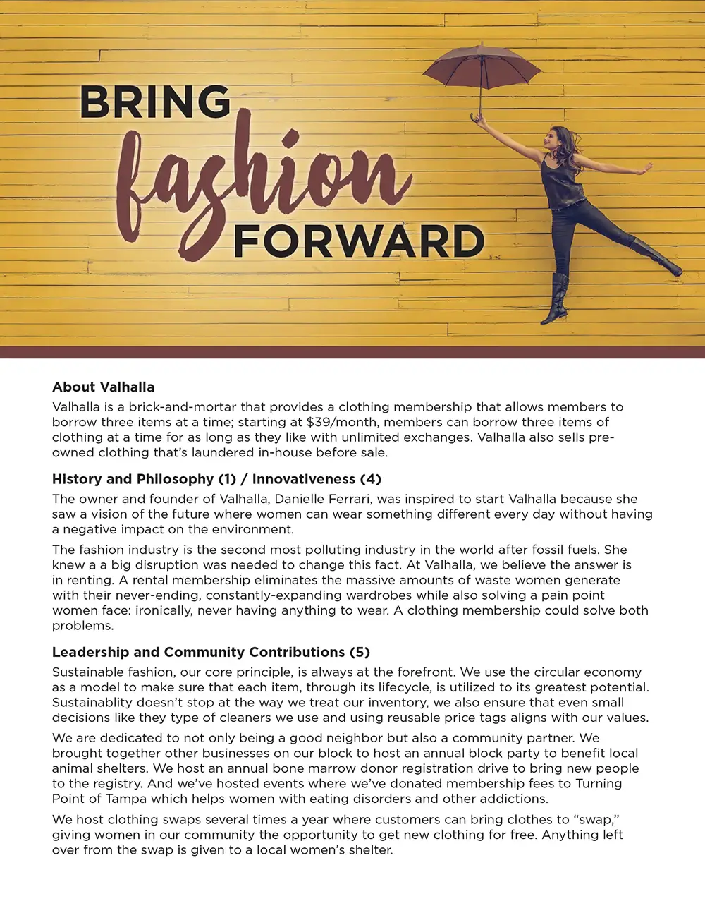
I develop designs that work across various applications and distribution methods. The Valhalla fashion forward piece works as both a standalone flyer and part of a larger campaign system, while technical pieces like environmental compliance materials balance regulatory information with engaging design.
Strategic Call-to-Action Design
Every piece includes strategically placed, compelling calls-to-action. Whether directing readers to QR codes, websites, or phone numbers, I ensure the next steps are clear and accessible. The Evify emergency services design prioritizes contact information, while the kids’ camp flyer emphasizes registration urgency and convenience.
Marketing Package


